
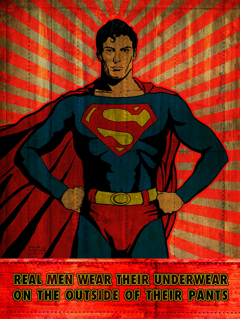
Of all the questions that have long vexed my mind, and made for so many sleepless nights, has always been the Big One: Why the shorts on the outside of the leotard? At long last, it is with great pleasure that I present intrepid cub reporter and talented new writer, Ariel Williams, who has finally succeeded in getting to the bottom of “Superman’s Underwear.” Please join me in welcoming Ariel to the depthRADIUS family.


Ihave always been a fan of comic books. I grew up in mostly small towns in the 80’s and 90’s and often had to entertain myself with only one or two television stations and no cable TV. Books were always a source of escape from the real world and from my own rather boring life. Art was also a way for me to express my own ideas and flesh out the images I saw in my mind’s eye when reading. From there comic books were a natural draw for me as they had both amazing tales like the books and creative visuals. The more I read comics the more I tried to learn everything I could about this unique art form. When it comes to comics, I’m the geek who usually has the 411…
A common question I get, especially from those that don’t read comics, is...
“Why do superheroes run around in those strange outfits?”

“Why does Superman wear his underwear on the outside?”
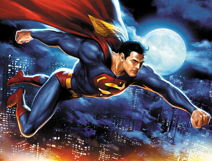
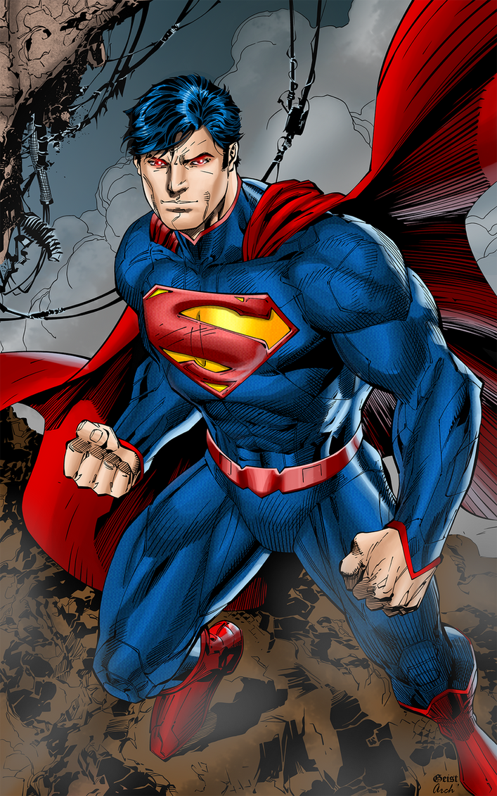
It really does seem strange when you think about it. Superman is apparently wearing tights with underwear over them and no clothes other than the spandex and his cape. This sartorial style is echoed in many comic book heroes with their origins in the earliest days of comic books in the 1930's and 1940's onward. The reason for the unusual superhero undies is a strange mixture of economics, printing technology and artistic talents trying to find a middle ground between the two.
— Aeschylus, in Prometheus Bound (c. 478 BC)


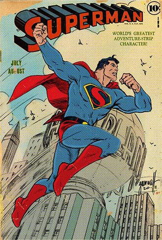
In the early 1930's and 40's, the printing of comics came in two forms, black and white and 4 color. (This is also where we get the term “4 color hero.”) In general, comic books were intended to be as cheap as possible so the lowest grades of paper were often used and the fastest and cheapest printing methods.
Comics and comic books were not considered a serious art form. They were a cheap diversion or something for children. The color printing was initially only reserved for the cover page of a comic because it was a costly process that required the ink to be applied in 4 separate stages, one for each color. The problem became that when doing this the machines had to run at a very high rate of speed to produce enough comics and they would eventually become misaligned and need constant adjustment. This is why we see comics from this era onward with the colors bleeding outside of the lines. This is especially true when color was later applied to entire comics.
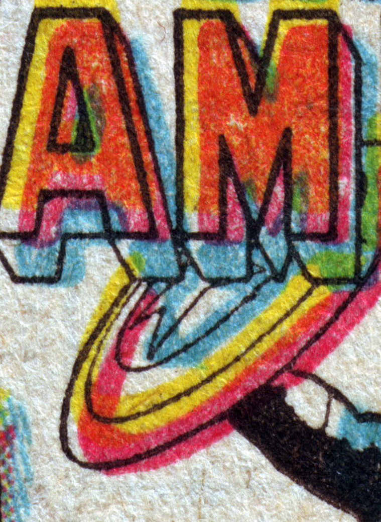
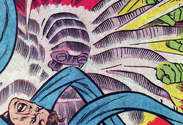
Due to these minor imperfections in the process itself the comics were produced with sharp clean edges defined by hard black and often the layouts would be done so that objects could be painted a single color. These restrictions and a lack of a proper gray constrained the art style to fit within the technology of the day. The methods they used to overcome this came in using either a style much like pointillism (halftone) as the image above or hard solid colors, hatching and crosshatching as below.
Keeping your colors simple was the best way to do this but it restricted character design and forced them to create an inventive way to make the character stand out.
— E. B. White, in "The Old and the New," in The New Yorker (19 June 1937)


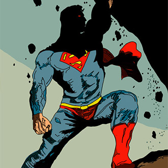
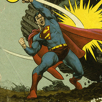
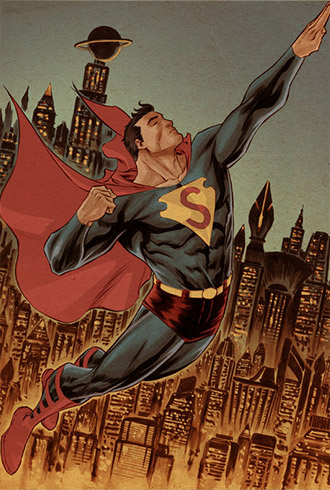
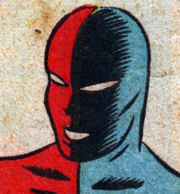
Working within the limitations I have just described, comic book artists took great strides to make powerful and lasting impressions. Right or wrong and consciously or not, this led to emphasizing hyper masculine or hyper feminine character traits to make the characters seem larger than life on such a simple format. We often see color changes or divisions at the head, chest, waist, hands groin and feet. This allows the characters to have certain "attributes" stand out.
Which one looks more "heroic"?
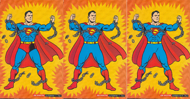
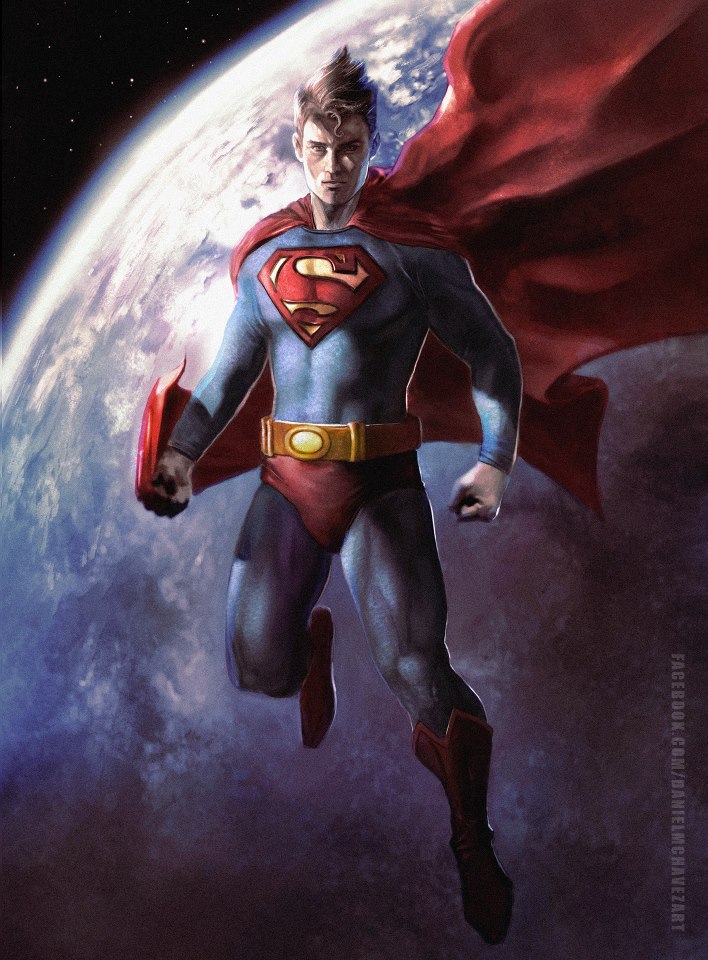
The center option almost seems to have neutered Superman with its lack of definition. While option three might be acceptable in this panel, in some poses or in very small panels in the comics his legs might overlap the groin area and the entire pose might loose definition. You literally might not be able to tell his leg from his a-hole. Also, inadvertently defining his "package" would have scandalized 1940's sensibilities.
Even characters that wore only a single color often had detail lines outlining the pelvis from the rest of the body so their features could easily be made out on small panels.
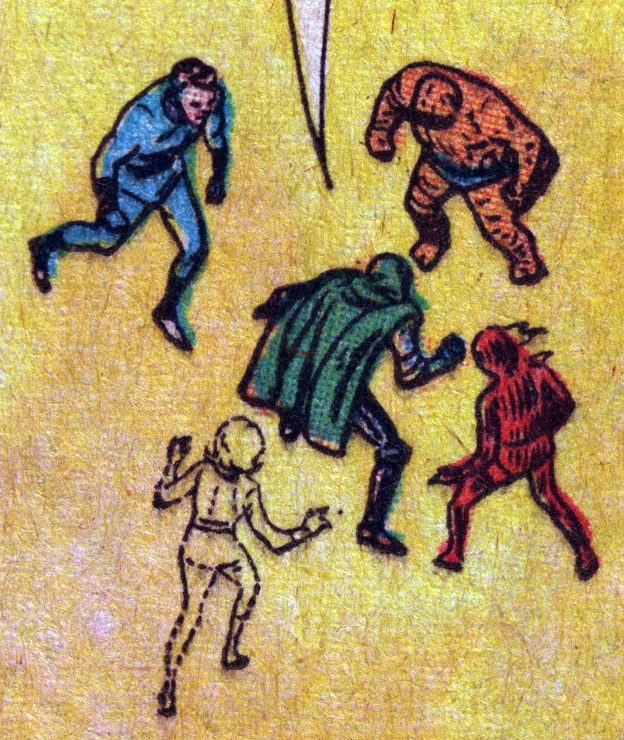
Here we can see what looks like "undies" even on the Human Torch and Mr. Fantastic.
— William Shakespeare, King Lear (1608), Act III, Scene 2


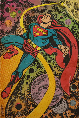
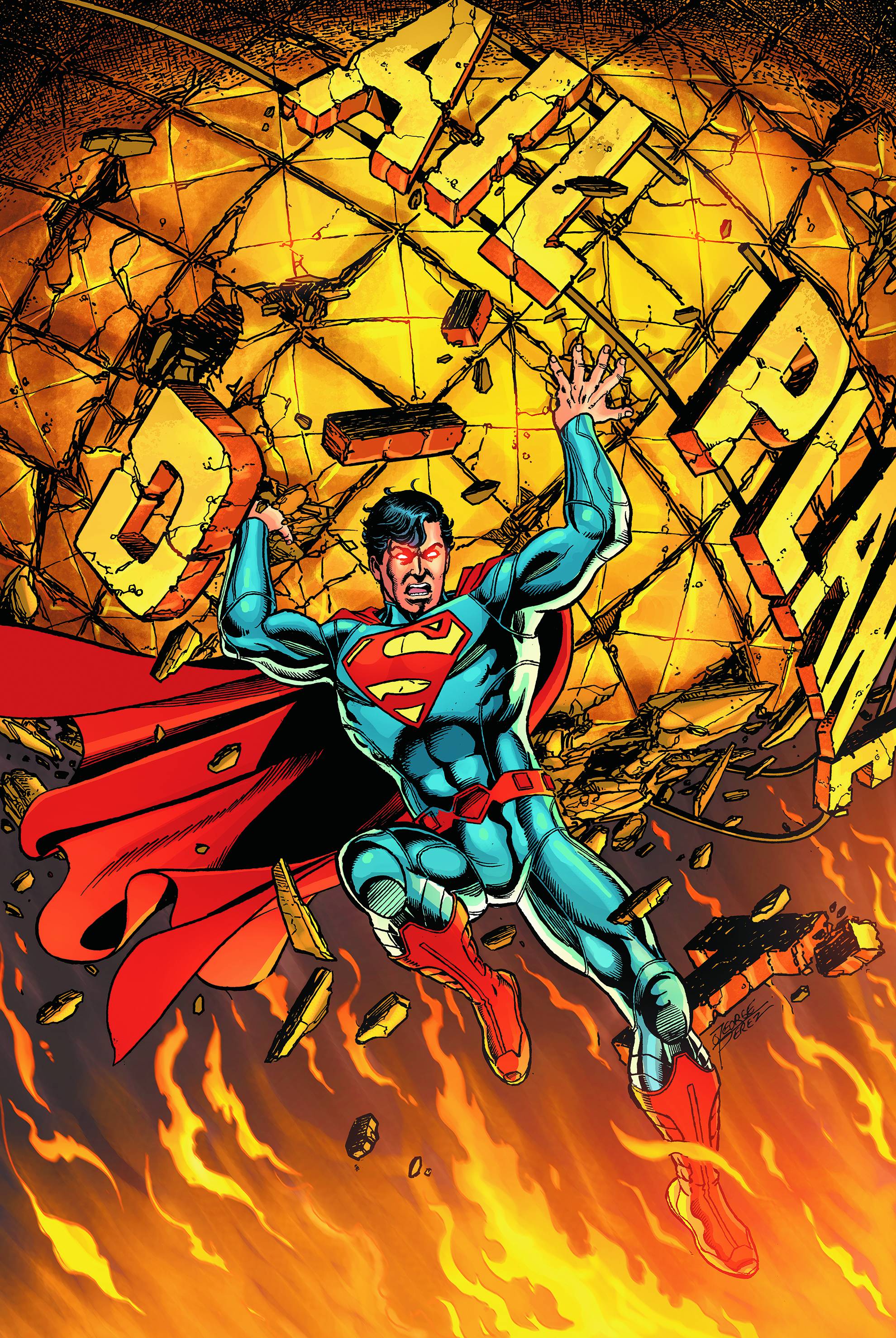
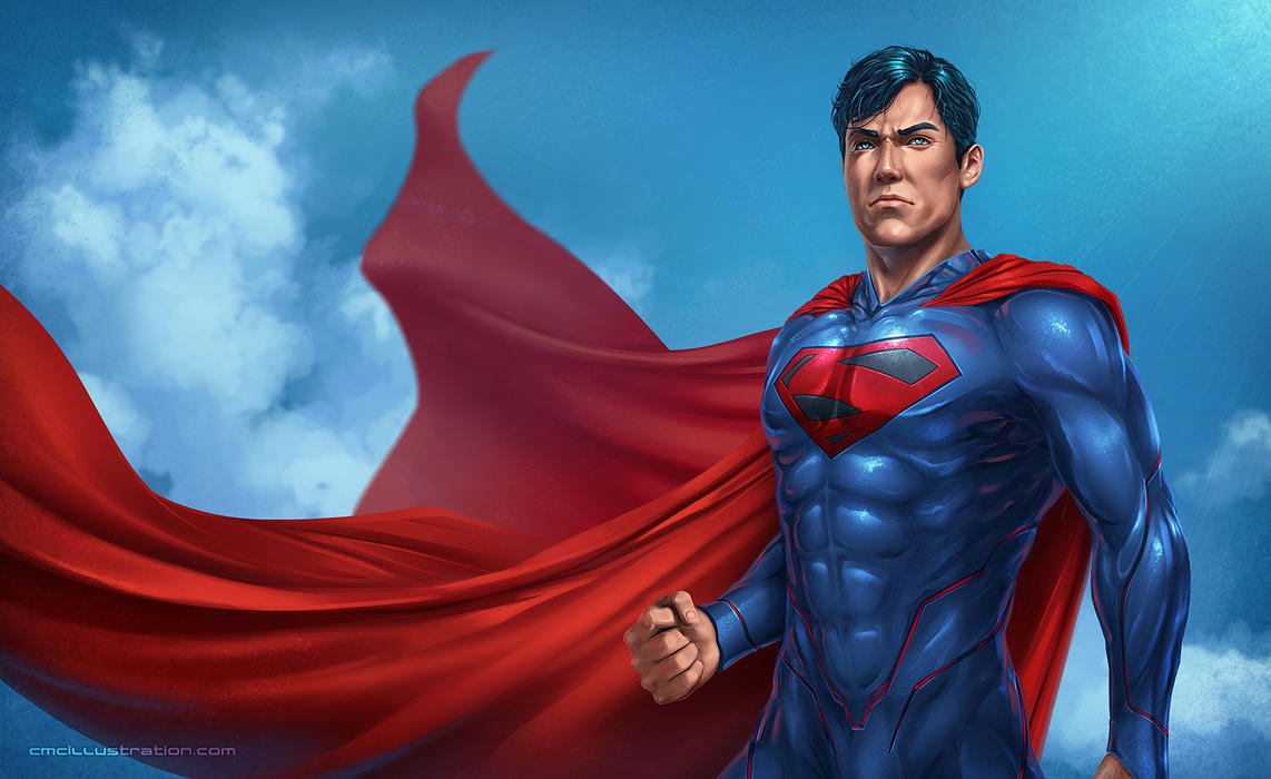
Modern comics are starting to move away from this trend a little as better printing technology has allowed smooth gradients and shading to compensate for the issues of the past and opened up a whole new range of possibilities. Even so, the iconic images of superheroes in comics are so strong that little has changed from those early days.
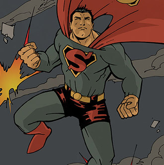
“Look ma no undies!”
(To be honest, even here a fine line is observed to make sure there is definition between pelvis and legs, but at least it doesn't look like underwear.) Even here we can see the issue of not segmenting the body by contrasting colors. In the pose to the bottom-left, Superman’s leg and groin area seem to blend together a bit too much for my likes but the shading makes it acceptable and the red belt provides a visual queue for his midline.


- Did you ever question why Superman wore his shorts outside his leotard? Or did you simply accept this as being the standard super-hero uniform? Can you think of other odd quirks we accepted in our comics heroes that were necessitated by technical/political/economic/social considerations more than by artists’ choices?
- If you are an aspiring comics artist, do you think you would have enjoyed the challenge of trying to solve the restrictions of primitive print production, or are you very grateful to be using today’s technology?
- Do you think more should be done to educate arts students in the creative innovations that were invented to keep comics alive in their earliest days? Should the comics narrative storytelling form get more of the respect regularly lavished upon early cinema?
- After reading an article like this one about Superman’s underwear, does this special knowledge make you feel just a little bit superior to everyone else not in the know?
- Funniest answer possible please: Youtubing the opening credits of the weekly 1952-58 Superman TV show, the bad guys shoot Superman in the chest. He stands there as a motionless target, smiling, hands on hips. The bullets all bounce off his big “S” insignia. Out of bullets, the bad guys toss their empty revolvers at Superman’s head. He ducks. Why?